One tool that always comes up in political discussions by nerds like me (and my great commenters) that attempt to define and pin down political philosophies is some kind of chart. I tend not to like them, because I think they tend to do a poor job explaining the relationships between various philosophies. But if done right, they are VERY useful in illustrating these differences and creating a framework for discussion.
So in very rough draft from, here’s mine:
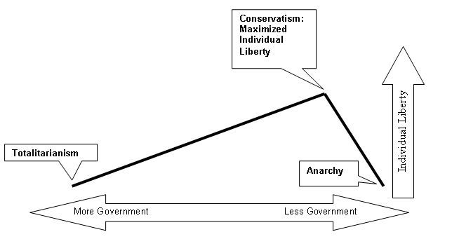
It is a simple, two dimensional chart, with the X axis being the amount of government, and the Y axis representing individual liberty.
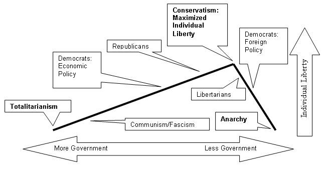
You can plot various philosophies and current positions of political parties like this:
Plenty more to come on the merits of these placements, but I think this is a good framework upon which to drape our definitions.
I don’t like most two dimensional charts (specifically the Nolan Chart and its variants). The problem is that most of those are made by libertarians who created a pre-spun chart to demonstrate how their philosophy is the only one which maximizes freedom. In order to spin it that way, they have to assume that social conservatism especially is necessarily restrictive on individual liberty. They also leave anarchy out entirely, an extreme position without which no comprehensive political spectrum is complete.
The only difference between this and a plain old left-right uni-dimensional line is that there is an entering argument built in. The chart’s peak represents fulfillment of a guiding principle that on some level must be accepted on faith as what represents an overarching ideal. After all, political philosophies and systems only exist as vehicles to achieve some kind of actual goal. I’m not conservative for the sake of being conservative, I’m conservative because I believe conservatism is the best way to maximize individual liberty, which I view as the paramount value in our social lives.
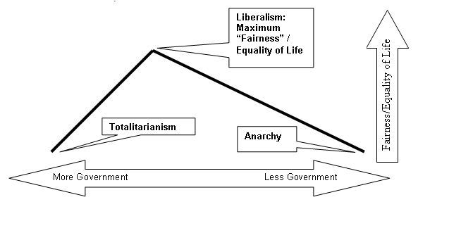
Alter the entering argument, and you alter the chart. For example, American liberalism values “fairness” and equality (of life, not of opportunity) as their paramount value. Their chart might look like this:
You could make countless such charts to reflect all kinds of “entering arguments”. But in practice, except for the Cobra Commander/Dr. Evil/Osama bin Laden crowd on the left, and these guys on the extreme right, the competing values of “fairness/equality of life” vs. “individual liberty” is really the great debate in American politics today.
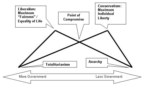
When you look at the two charts overlayed on top of each other, it’s clear why there is so much disagreement and contention (which I actually think is often a good thing):
Here, the Y axis is an increasing of each side’s core value, which in each case reaches a maximization point at which either more or less government actually limits the ability to achieve the desired end.
(Plus it looks like a sweet bat thing, which is WAY cooler than that Nolan Chart…)
In the middle, which is less than either side’s ideal, is where many of us sit. If your paramount value is merely to all “get along” to the maximum extent possible, then this is actually the ideal location for you. The danger of this “value” is that is also can be met at either extreme end of the spectrum, where we all agree that life totally sucks (with the possible exception of the totalitarian dictator himself).
The other problem with what at first may look like a nice, comfortable saddle of moderation is that the two peaks don’t necessarily represent two values that are equally good, even if mutually exclusive. For example, if every single American had to stand in a breadline each day and pay for moldy rolls with meager wages from our jobs in the fields, our lives would absolutely be fair and equal to each other. (And incidentally, I think that’s the only realistic way to achieve that ideal.) The Cambodians even tried giving that idea a shot once. I think we ought not repeat that little experiment…
—
I’ll wrap it here for now, because I need to go to bed and because this is only a framework for discussion on specific issues. Please hack away at these rude drawings. Can they be improved to create a more accurate and useful visual representation?


I like it. Perfect! And I you make a great point that the two peaks are not equal. Of course, the liberal would argue that a government that maximizes individual liberty results in leaving the children or the environment behind and unfettered “corporatism,” and is ultimately selfish.
Interesting, but I think the Y-axis metric needs to be kicked around a bit more. You put anarchy as having minimum individual freedom, which doesn’t make sense.
Given that government controls the amount of individual freedom, it seems like there would be a null space in which small government models are unable to restrict freedoms to a certain extent until, at the far right, the absence of government means that there are no restrictions.
But anarchy does NOT maximize individual freedom. If you cannot leave your house for fear of being attacked, robbed, etc., your freedom of action is actually very restricted. Without a government to enforce contracts such that people can rely on them and trust them, you are reduced to a ceiling of subsistence living – inhibiting commerce, development, specialization, etc. Government is not the only thing that can take away your individual liberty.
SOME government is necessary to “secure the blessings of liberty.” Too much government or not enough government, though, will unduly reduce that liberty, either by restricting it outright or by allowing OTHER individuals to take it away from you, respectively. The key is to strike the proper balance to get the maximum benefit out of the government.
Oh, and I also like that the point of compromise ended up right of center. If you intended that, kudos, and no wonder you were up so late.
I didn’t, really – the last one isn’t to scale, and isn’t necessarily static.
Good work, Orrin. I like it – a lot. It sure makes your position clear. I appreciate the concept that one can change the Y-axis to whatever one’s highest value / ideology is, and plot it against how much government would be required to maximize it. I really like the way it shows that anarchy is beyond the optimum for individual Liberty. Good stuff. That there was no place for anarchy was certainly a weakness of the traditional Left/Right spectrum line and my derivative Circle Chart. I have often verbalized my position on the Circle Chart as, “Top-dead-center – just a tad below anarchy”; but that was the best I could do. Otherwise, to label the upper point anarchy, would have looked like I was advocating it as the ideal.
While I certainly agree that “Fairness” vs. “Liberty” is the predominant debate in America, these are by no means the overwhelming motivations for political activists demanding government intervention in our lives.
Obviously, those who wish for government to enforce their religious moral codes would need their own Y-axis metric; and to keep the scales consistent (so that an overlay made sense), each sect would need their own entry point. E.g., those Muslims wanting to institute sharia law, would be very different than those desiring to enforce the Christian moral code, because the former would require more government.
Then, those angry racist Blacks demanding racial preferences and reparations for the transgressions of our ancestors toward their ancestors, would need a different metric of their own. I suppose the gay rights activists aren’t really striving for mere equality either; are they? They would need their own Y-axis scale for their special preferences agenda. The environmentalists would need at least one unique metric, probably more.
What strikes me is that you could mark the X-axis at the point of the peak of each value graph, and I could mark a vertical line bisecting my Circle Chart with the latitude of each ideology (regardless of which side of the circle I have it on). Then, if one of us rotated our line 90° and overlaid them, they would essentially be identical.
Then, we would be back to just a semantics problem. You could cling to the term “conservative” if you choose; but I would still recommend against it for marketing purposes. While I am partial to the word “Liberty,” “libertarian” probably isn’t the best label either, for the same reason. We have discussed this elsewhere, and I remain convinced that we need a new (unloaded) term.
Speaking of marketing, I freely admit that my intended purpose for the Circle Chart is to influence those who have not drunk any ideological Kool-Aide to see the value of joining me in the land of individual Liberty. How is that a bad thing? I do not disagree with your logic here, and seriously appreciate the clarity of thought that your graphs engender; but I would question their value in convincing your Liberal Friend, et al, to abandon their “feelings” based fairness value for our “reason” based Liberty value.
That is a tough sell, which needs to be done with some measure of finesse. This is one of the main reasons I have keyed in on the centrist / moderate / independent theme. Those who are already disgusted with the Incumbrepublocrats don’t have that far to shift.
I am going to spend some time amalgamating our graphs. Reagan’s quote is too apropos to waste, and the Left/Right duopoly meme is so negatively ingrained in the American psyche, that I will keep my line vertical; but make it a broad double arrow bisecting the hemispheres of my circle and label it the same as yours. I may add some illustrative auxiliary individual X-Y graphs similar to yours to the marketing package; but I will just make the Y-axis “government” and the X-axis the value/ideology, to maintain the UP/DOWN orientation.
At the same time, I will be able to incorporate my new economic systems insight, which will roughly place socialism and corporatism at the same point somewhere near the bottom of the line, with free market laissez-faire capitalism near the top. I need to include the “oppressed minorities” preferences category and environmentalists too, as mentioned above.
Thanks again for the great work and the late night. This is progress. ?Dave?
Which is why I suggested the Y-axis metric needs work. Is it actual freedom from government interference? In that case then anarchy does have the highest Y value.
Is it supposed to be some measure of effective freedoms enjoyed? If so, then what about social freedoms? And how do you measure that?
I know a whole lot of people who would argue that conservatism does not provide any maximum of freedoms because of the social/moral restrictions that so frequently accompany it.
No – it’s individual freedom, with ACTUAL ability to exercise it. Forcible coercion limits it, whether the government or the highwayman is holding the gun. “Soft” pressure in terms of peer pressure and societal approval/disapproval generally do not.
Take adultery again for a good illustration of this. If religious people attain public office and then outlaw infidelity, that’s on the leftward downslope away from individual liberty. If a group of people from the church takes it upon themselves to stone someone for it without the sanction of government, but government for whatever reason is unable to stop the practice, that’s on the rightward downslope away from personal liberty.
Adultery is bad, and it is to society’s benefit to minimize it, but preventing it is NOT paramount to maximizing individual liberty. So how do we achieve this individual policy preference while not ignoring our core values? With peer pressure and societal condemnation. You can still do what you want without being forcibly punished, but the cost-benefit starts weighing enough against the bad behavior that less people are as likely to engage in it. You still have more adultery than you would if you, say, made it a capital offense, but you have successfully prioritized your values and adjusted governmental policy accordingly.
Glad you like it, Dave. Beyond the examples you cite, you could conceivably plot a different peak for every single policy goal, and then calculate how much government is necessary to achieve each one. In fact, I think that’s what most people do. But the problem with that is then the policies start interfereing with each other, and then you spend all your remaining time and energy running back and forth trying to fix an inherently unbalanced system, never being able to stop because each “fix” of this policy or that creates problems in another one over there.
Something has to come first.
The whole point of my blog is to meld these seemingly disparate policy preferences into a unified theory, shunting the ones that cannot conform, and then using the theory to prevent forays into well meaning but then ultimately counterproductive policy (NCLB, Medicare expansion, etc.) to what government is ULTIMATELY and PRIMARILY there to legitimately achieve.
The problem I see with the uni-dimensional X axis is that while there is either more or less government, there is also smart regulation and dumb regulation which could arguably occupy the same spot on that line, even where the smart regs are preferable to no regs, but where no regs are better than the bad regs.
(BTW, since the topic keeps coming up, see my thoughts on Mike Huckabee, the quintisential religious guy people keep calling conservative but is actually anything but.)
The problem is with the Y dimension. Individual liberty. Individual liberty is indeed maximized with no government. However, security, comfort, entitlement and wealth are not necessarily maximized.
Your graphic seems to be somehow including those elements into individual liberty – which is wrong. It opens the door to the liberal argument for more government. Indeed, with your graphic, the liberal can disagree with your optimal point, move it to the left and say that government health care increases “individual liberty.” Put another way, the graphic needs to distinguish between liberty, which imposes no positive duties on another, and entitlement, which does.
I’m no anarchist, and I’m willing to exchange the freedom to kill another man in exchange for the security of not being killed – but I wouldn’t say it increases my “individual liberty.” It’s a trade off, and a conservative one at that, since, from time immemerrable, governments have provided for it.
Maybe two dimensions is simply not enough.
I disagree that “individual liberty” includes any kind of personal entitlement. I also disagree that government is the only entity capable of taking away personal liberty.
I understand what you’re saying, and in fact, that’s how liberals often justify their programs in a center-right country. The difference is that we ALL get to use roads and cops. “Universal Health insurance” is something taken from some to be given to others.
Government exists in part to prevent OTHER PEOPLE from taking my liberty away. Also, it is important to keep in mind that “maximizing personal liberty ” means maximizing it for EVERYONE EQUALLY. That’s why the liberal argument that entitlements maximize security and thus liberty just like police officers fails – in order to provide such an entitlement, half the population must be forced to give up their liberty and property to the other half who didn’t earn it.
This is why a progressive tax structure is not conservative, and why, as you and I have discussed many times, it is a time bomb to a free society – set to go off as soon as the people who don’t pay taxes outnumber those who do, and can vote to take their money.
Orrin, I am still periodically twiddling with redesigning my circle chart to incorporate the new insights your model offers. I was just reviewing your second chart above, and note that you place conservatives and libertarians very close together. I am curious which government restrictions on Liberty that you believe libertarians to eschew, which provide your conservatives more “effective” individual Liberty. I understand your point and principle; but could you give concrete examples of where you think libertarians go too far?
I am also puzzling over your placement of the Democrat’s foreign policy. I have always regarded the Left’s foreign policy to be essentially that of the Wilsonian Progressives, who in order to achieve their dreams of a New World Order, would empower international institutions to trump our sovereignty. This would seem to increase government power and diminish individual Liberty. Where am I going wrong? -Dave-
Notice that both Libertarians and the Democratic foreign policy is on the “not enough” government side of the peak. My concern with both is the potential danger to life, safety, and the ability to move through society freely (which is critical to maximizing individual liberty) which comes from too little law enforcement/defense, a la knee jerk opposition to the Patriot Act, warrantless overseas wiretapping, etc.
Dem FP hasn’t been of the Wilsonian type since Vietnam (at least). Since then, it has been worse than isolationist, it has been open appeasement, hoping our enemies will “like us”, without the “big stick” necessary to create ACTUAL peace instead of the illusion of it. Because overt policies of appeasement take less government than, say, Reagan’s 600 ship Navy, I’m forced to place that on the “too little” government side of the peak.
I see we have another semantics issue. Since reading his book, “Special Providence,” when I speak of foreign policy, I have adopted Walter Russel Mead’s four “schools” of American foreign policy thought (note: the FAQ misspells Mead’s name). Since Vietnam, Carter was definitely a Wilsonian, and to the extent that he wasn’t just a crass Pragmatist politician, so was Clinton. The UN is a quintessential Wilsonian institution; the WTO is a Hamiltonian one. Jacksonians, and to a lesser extent the Jeffersonians, see mischief in both.
I think you are confused by the Jeffersonian (e.g. ACLU) wing of the Democrats’ coalition. These are the characters that get twitchy over the Patriot Act, wire tapping, et al, domestically and certainly do lobby for an isolationist foreign policy; but they have not been much in evidence at Foggy Bottom for a very long time. The real struggle at State when Parties change, is between the Wilsonians and the Hamiltonians. The first Gulf War was a Hamiltonian venture; Clinton’s Bosnia adventure was Wilsonian. The “neocons” are really Wilsonians who fled the crippling effects the Jeffersonian wing on the Democrat Party has had on their election potential, and hijacked the Republican Party (a ploy Jacksonians may need to consider in reverse).
There they have made common cause with the resident corporatist Hamiltonians, and get accused of having their motives (e.g. war for oil), but it isn’t true. They want to make the world “safe for democracy,” not just “safe for business.” Bush, actually a Jacksonian, has been ill advised by these elitists, who regard him as rather vulgar. His instincts, portrayed by his disdain for “nation building” in 2000 campaign speeches, would not have accommodated them before 9/11 changed the playing field. After that outrage to his Jacksonian sensibilities, he allowed them their agenda as long as he got to play unrelenting sheriff with the Jihadis in the process.
BTW: Personally, I am a Jacksonian who could make common cause with the Jeffersonians, but have no affinity for the other two schools. I note that the FAQ suggests that Libertarian Party is fundamentally a Jeffersonian organization. Perhaps that is one reason that I always use a lower case “L” when I say I am a libertarian. I have almost nothing in common with the actual agenda of the ACLU; although their principles sound good on paper and I share their mistrust of government. My Jacksonian heritage gives me too much esteem for our traditions and shared values as Americans, to have any respect for the ACLU’s attempt to dismantle them. 🙂 -Dave-
[…] post there this morning sparked my interest; because of a debate I have been having with Orrin at First Principles, over the definition of “conservative.” It included a link to a document called The […]
Orrin, this post is for you: Secular Right
Why so quiet lately? I hope all is well. -Dave-
Oops… sorry for the duplication. I get mixed up over which blogs post trackbacks and which don’t. It wasn’t there when I opened the page. -Dave-
Nope, all is well – just super busy lately keeping the world safe for criminals! I just need more hours in the day….
Cool. Back when I was a cop, I didn’t have much use for guys like you. 🙂
Did you read The Sharon Statement? What did you think of it in regards to your quest? -Dave-
[…] from being buried in his workload, I need to move it near the top of my to-do stack, as it was the discussion on his blog that instigated the change. Since I have the chart itself done, I have uploaded it as a […]
Sorry, ignore that trackback. I forgot to put a title on the post and when I changed it, I changed the permalink. The post, which has my new spectrum chart and credits you for instigating the change is here. -Dave-
[…] if I can just convince Orrin… […]